High Level Plot Functions
Figure 1
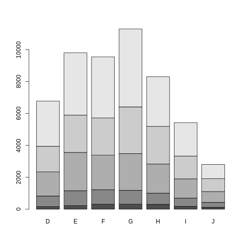
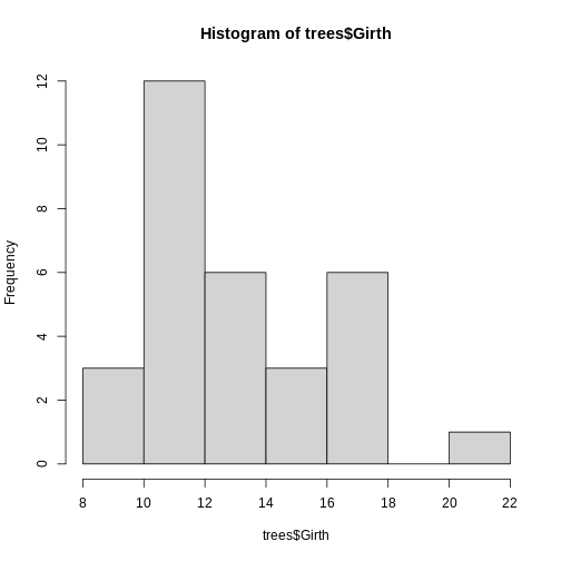 With that, we have successfully created our first histogram by simply
just specifying the data input. However, there are a few components of
the plot to note:
With that, we have successfully created our first histogram by simply
just specifying the data input. However, there are a few components of
the plot to note:
Figure 2
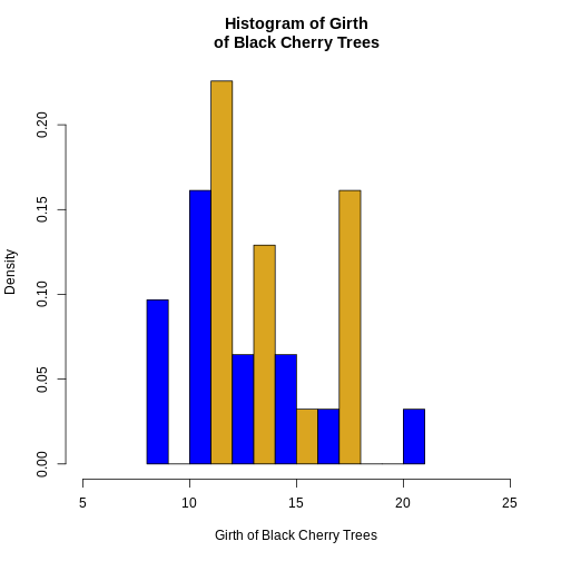
Figure 3
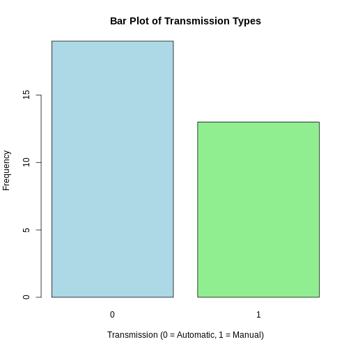
Figure 4
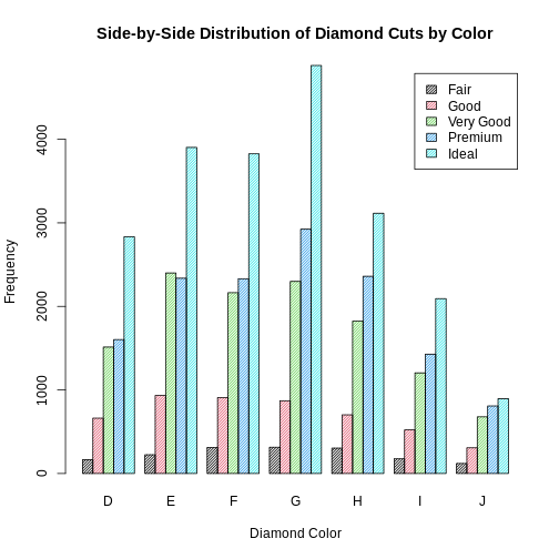
 In addition, if we want to create a side-by-side
barplot instead of a stacked barplot, we simply set the optional
argument
In addition, if we want to create a side-by-side
barplot instead of a stacked barplot, we simply set the optional
argument beside = TRUE.
Figure 5
Low Level Plot Functions
Figure 1
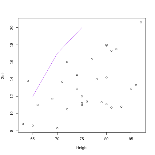
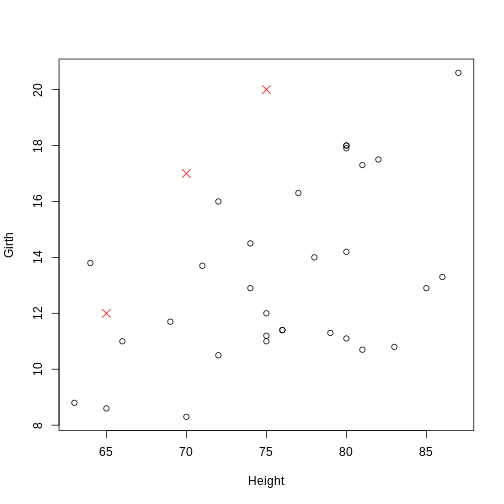 The coordinate pairs can alternatively be specified using a a two-column
matrix or data frame, a list with two components called
The coordinate pairs can alternatively be specified using a a two-column
matrix or data frame, a list with two components called x
and y, or a formula y ~ x.
Figure 2
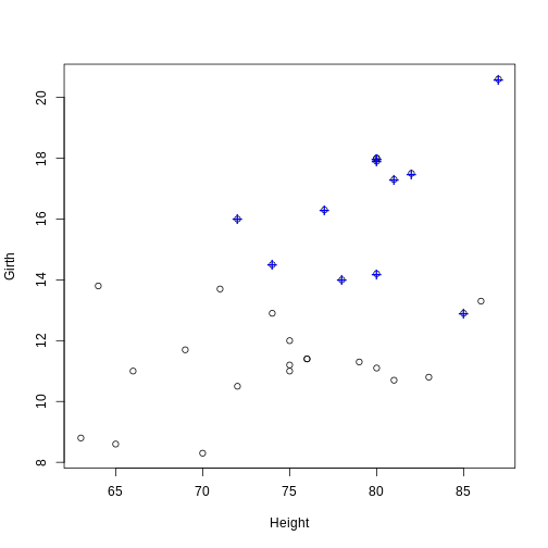
Figure 3
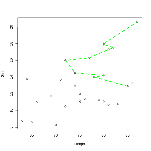
 Notice: Even though
 lines() and
points() are separate functions, the functionality of both
are actually the same. The points() function can be used to
add line segments by setting the optional argument
type = "l". The lines() function can be used
to add points by setting the optional argument
type = "p".
Figure 4
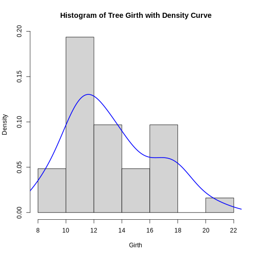
 Notice:The
 lines() function can also be
used to add a smooth density curve over a relative frequency histogram
(prob = TRUE). The density() function computes a kernel
density estimate of the data, which can be visualized as a smooth curve
superimposed over a histogram using the lines()
function.
Figure 5